Food Pairing is an interactive table that helps users experiment with flavors and see how different ingredients work together.
Create a tangible user interface that fosters collaboration through both digital and physical interactions.
User Experience, User Interface, Physical Prototyping, Video Editing.
Adobe CC, ReacTIVision, TUIO, Processing, Sketch.
Ruitao Liang, Tai Hong Chen, Julius Winckler - 6 Weeks / Fall 2018
Each ingredient has a unique flavor profile, and can be added to different dishes. The pie chart around each dish will change to show the flavor profile, and the amount of an ingredient can be increased or decreased depending on the taste desired. A graph in the middle shows the flavor profiles of all the dishes combined.
Check out the video for all the features!
To start the process, we focused on exploring the ways we could make cooking a collaborative effort. We created a rough paper prototype of our initial table using scrap materials. Through this, we were able to iterate on our ideas by acting as our users and testing different actions. For example, we learned that circular spaces afford more collaboration as everyone has equal reach of the table, and that pegs afford lots of picking up, placing, and turning.

After coming up with the concept, the team was divided into two halves: the coders and the makers. As one of the makers, I was in charge of the user experience and interactions, including the projection work and creating the interfaces (tangible and digital).


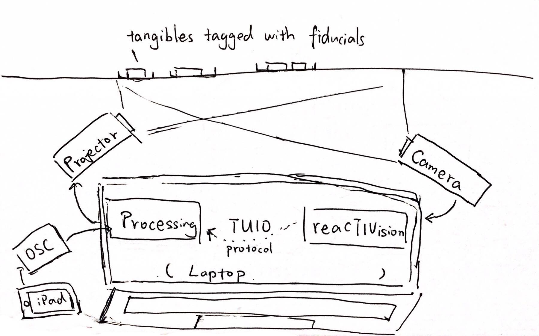
An interesting challenge we ran into was the height of the table proportionate to the projector. For users to comfortably interact with the table, it couldn't be more than 3-4 feet tall, which was too short for the projection to be angled straight from below. Thus, we used a mirror underneath the table to bend the projection up, and aligned it to the center of the table through calibration.
Designing the UI was also tricky, as the interactions had to be triggered by the ingredient blocks (versus typical screen-based touch/tap gestures) and simple enough to recreate with code. We decided to divide the spots for interactions into four different zones with feedback that changed or appeared according to an action or input. This allowed the system to register when an ingredient was added or removed, and indicated to the user how and where to interact with the table. The colors chosen in the pie chart also corresponded with the flavors represented.


Version 1
Version 2
In process final
To make the table react to user input, we tagged each ingredient with a fiducial and assigned it a unique ID and flavor breakdown in numbers. Using processing and reacTIVision, we were able to track when an ingredient was added, removed, or increased/decreased, which allowed the system to change accordingly.
.png)

After much testing, we created the final version that was able to be used by multiple users and reacted in real time to their actions.

Making an interactive table was a very rewarding experience, and satisfying to see our concept become reality. However, because we focused on making it actually functional, it limited the amount of features we could implement.
If we had more time and resources, we would add features that help the users synthesize the information displayed on the table. For example, going beyond just showing the different flavor profiles, and including what other ingredients could be added along with what it says about the dish.